Case study 01Client project · Fintech · Web appWeb platform and borrower app
Rinova
The lending platform behind a micro-finance lender.
A web platform where a micro-finance lender's staff, credit managers, partner banks and affiliates work the same loan application, from lead to sanction.
Role
Sole product designer
Worked with
The client and our development team
Platform
Web app with five role-based portals
Scope
Product scope, 83 screens, design system, handoff
Rinova is a pseudonym. Names, figures and applicants in the screens are sample data.
The problem
A loan file changes hands four times. At each hand-off the next person had to get familiar with the file again, documents could go missing and customers could be left waiting without knowing why.
What I did
Turned the client's brief into five portals on one shell, 83 screens, a design system and a state model the developers built from while I was still designing.
The call
I designed a single review screen that every desk shares, with twelve states for the stages of a loan. The layout stays familiar as the file moves between people.
ILead
The business behind the platform and the brief it came from.
01The business
What the platform is for
Rinova is the operations side of a micro-finance lender. Customers apply from the borrower app, which I also designed. Everything after that happens across five portals that each see the same file from a different desk, and that web platform is what this case study covers.
Rinova earns when a file reaches sanction and the money is disbursed. The platform needs to get each file there with as few delays and send-backs as possible.
The bet
If every role works from the same file and every send-back includes a reason, loans should reach sanction in fewer rounds and customers should wait less.
Admin · 42 screens
Runs the business
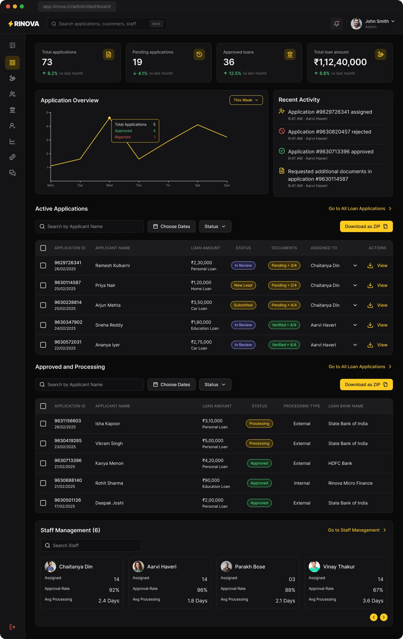
Sees every file, reassigns staff, onboards banks and affiliates, tracks sales and finance.
Staff · 14 screens
Verifies the file
Works a personal queue, checks each document, asks customers to re-upload.
Credit manager · 12 screens
Decides the route
Sets the amount, keeps the loan in-house or sends it to partner banks.
Banking partner · 9 screens
Sanctions the loan
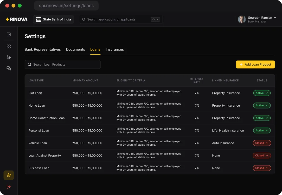
Receives a complete file with a ZIP, approves or rejects, manages its loan products.
Affiliate · 3 screens
Brings in leads
Follows each lead's status and sees commission earned, paid and pending.
Following one loan's money
Revenue, insurance and platform fees came up again and again in the client's review notes. Tracing the money in one loan showed me what the dashboards needed to count.
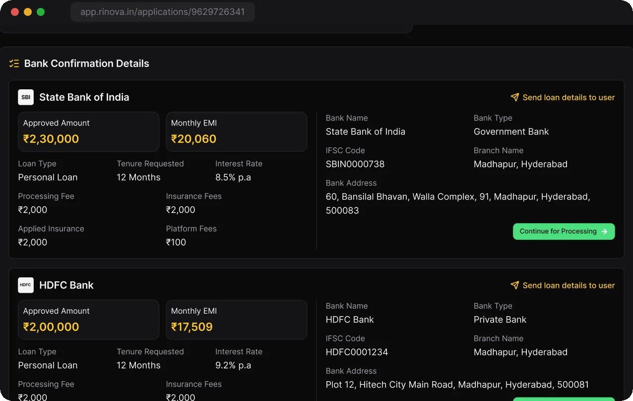
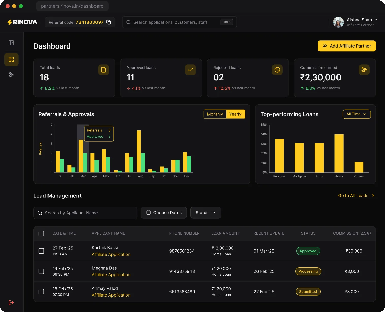
So the offer lists every deduction and the amount the borrower receives. Insurance became a product line with its own KPIs. Affiliates earn 2.5% on each approved referral, and the admin sees that commission across the whole partner network.
Application 9629726341Ramesh Kulkarni · personal loan
SanctionedSBI's offer at 8.5% a year over 12 months₹2,30,000
Reaches the borrowerCredited four days after acceptance₹2,25,900
Repaid over the termTwelve EMIs of ₹20,060; the interest goes to the bank₹2,40,720
02The brief
Working from the brief
I had no direct access to borrowers, staff or bank officers. My inputs were the client's written brief and the notes they left on each review round. The brief described how a loan file moves between people, and I turned that into what each role needs to see and do.
Every desk sees one file
The same application record, ID and timeline appear in every portal, trimmed to what that role acts on.
Send-backs are planned for
Rejecting a document, returning a file to staff and re-uploading are designed paths, each with its own state and message.
Banks get a complete file
Partner banks open a finished dossier with scorecard, verified documents and a ZIP, and respond with an approval or a rejection.
The constraints
Developers built alongside the design, so every state needed a name and a rule before its screen was final.
KYC documents are sensitive, so each role sees only what it acts on.
Five roles on one codebase meant one shell with role-based navigation.
Out of scope: automated underwriting and the banks' core systems.
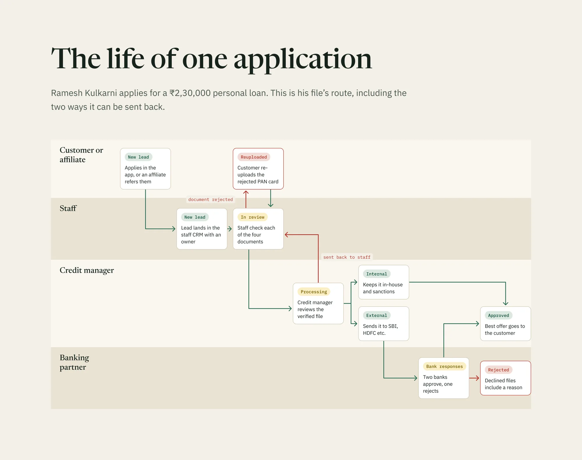
The life of one application, including the two ways it can travel backwards: a rejected document and a file sent back to staff.
IIVerification
How a file is read, checked and sent back, and the calls behind it.
03Decisions
The calls that shaped the product
Most screens came out of a few product decisions, and each one had a trade-off.
Where a file is reviewed
ChoseOne review screen in twelve states, shared by staff, the credit manager and the admin.
Gave upScreens tailored to each role.
WhyA file changes hands four times. With the same layout at every desk, each person picks up where the last one left off, and developers build one screen with stage blocks.
How banks receive a file
ChoseSend one file to several banks at once and compare their offers.
Gave upSimpler one-bank-at-a-time routing. Partial rejections needed their own state.
WhyBanks respond at the same time, so the customer only waits as long as the slowest bank.
What a rejection covers
ChoseReject a single document, with a reason.
Gave upA quick "reject file" button at the staff desk.
WhyIf a PAN card is blurry, the customer re-uploads only that document. The rest of the file stays verified.
What a bank can see
ChoseOnly the files sent to that bank, in a portal under its own name.
Gave upA shared partner view that would have been faster to build.
WhyKYC data stays with the people who act on it, and one bank's numbers are never mixed with another's.
What affiliates touch
ChoseLeads, stages and commission. No documents.
Gave upAffiliates cannot fix a document for their customer.
WhyFewer people handle KYC data, and what affiliates want to know is whether a lead converted and whether they were paid.
Actions that cannot be undone
ChoseA confirmation step before a file goes to banks.
Gave upOne extra step for the credit manager.
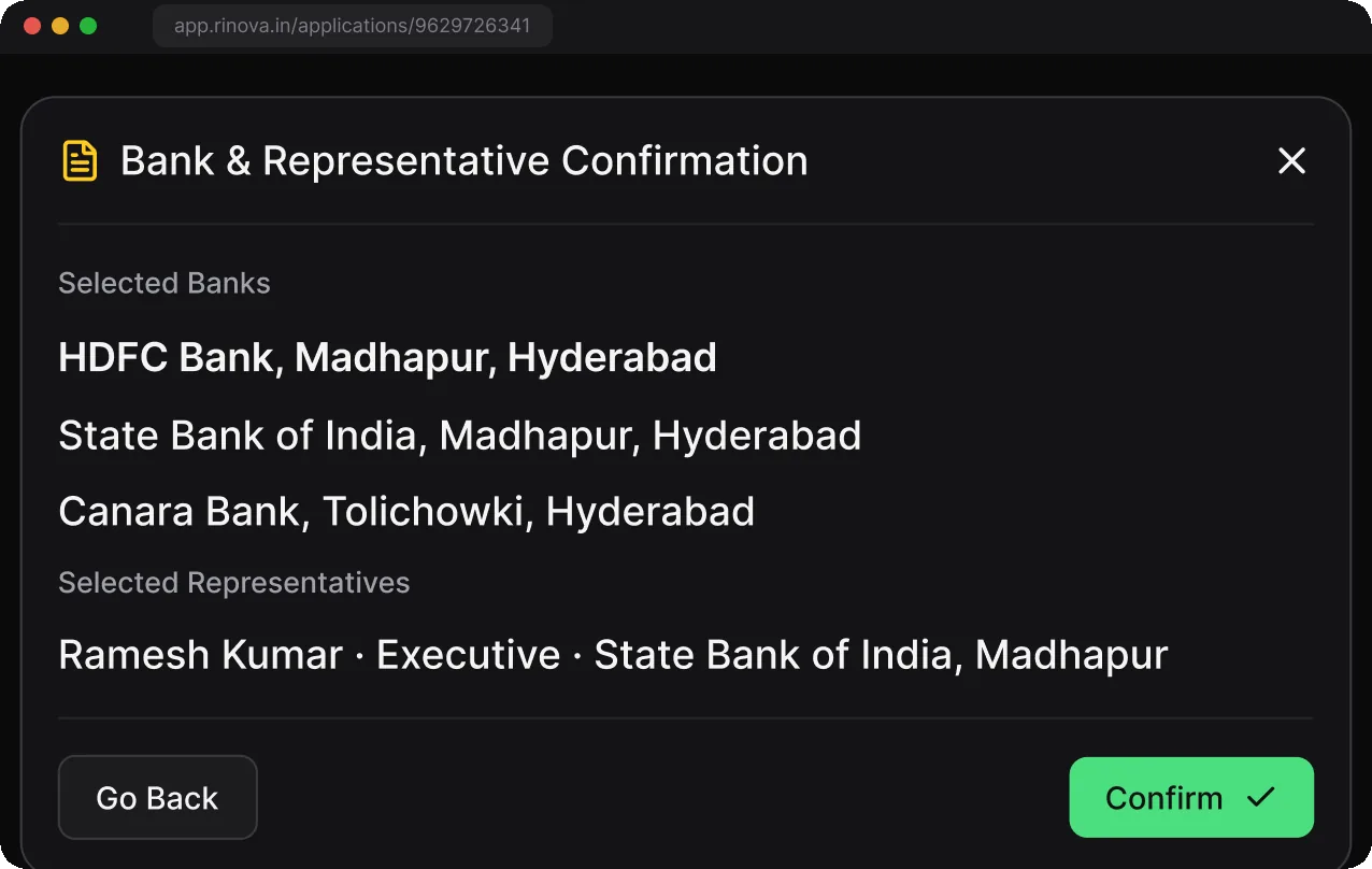
WhyA sent file cannot be recalled, so the last look lists every bank and representative it goes to.
Who signs in where
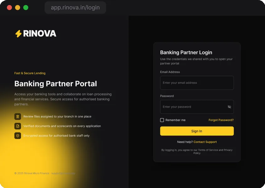
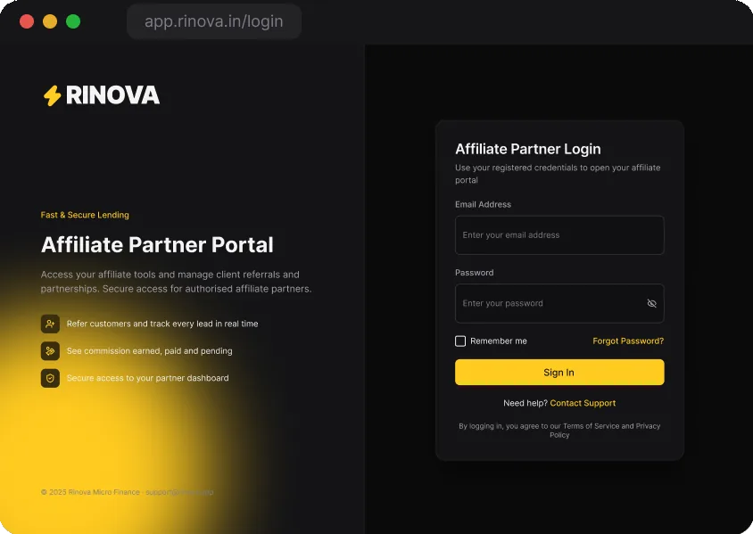
ChoseOne internal sign-in with a role picker. Separate sign-in pages for banks and affiliates.
Gave upThree sign-in pages to maintain.
WhyPartners never see internal roles, and each sign-in page explains why that partner would use it.
04The review screen
One review screen with twelve states
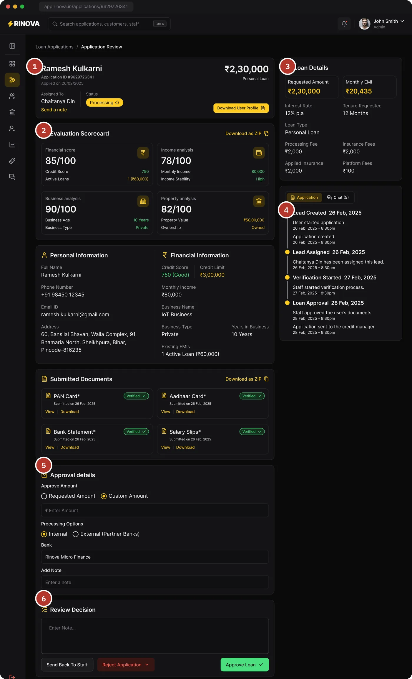
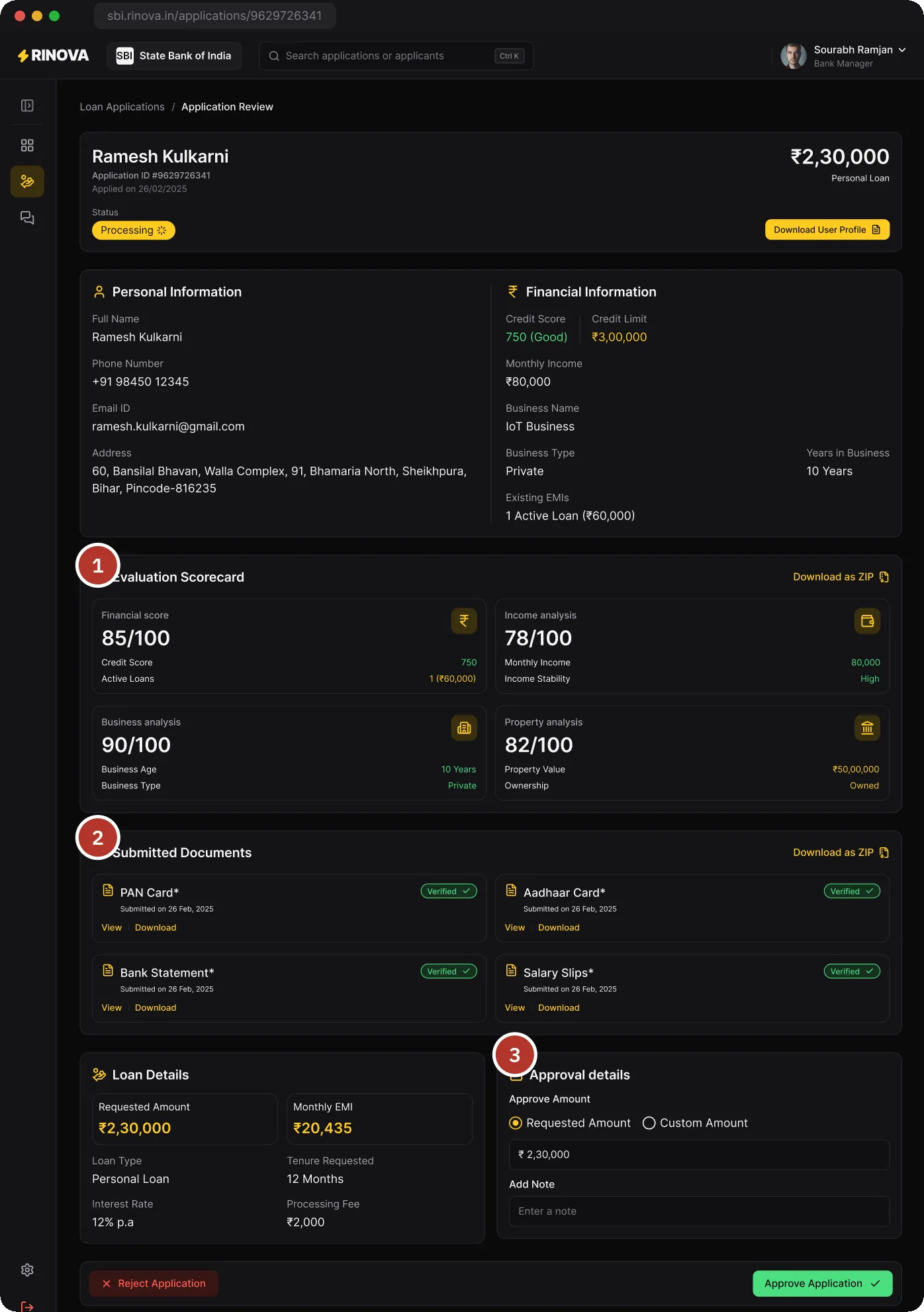
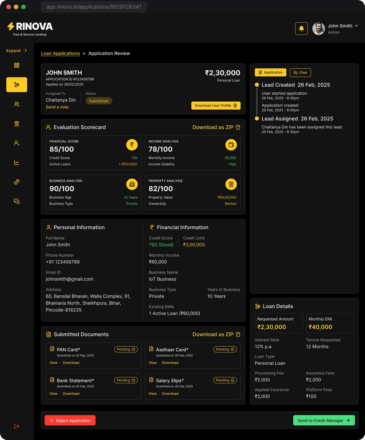
The application review is where most of the work happens. The layout stays the same and only the stage-specific blocks change, so a staff member, the credit manager and the admin all read the file the same way.
1
Applicant, amount and owner
Name, amount, loan type, stage and owner in one card, with a short path to message the owner.
2
Scores with their evidence
Four scores out of 100, each showing the two facts behind it, so reviewers don't have to scroll to see where a number came from.
3
Loan terms first
The right column opens with the requested amount and the EMI it implies, then fees and insurance.
4
Every hand-off on record
A timeline of each step with who did it and when, next to the chat with the customer.
5
Decide the route
Approve the requested or a custom amount, then keep the loan in-house or open the partner-bank picker.
6
One row of outcomes
Send back to staff, reject with a reason or move forward. The note sits above the buttons.
Sending a document back
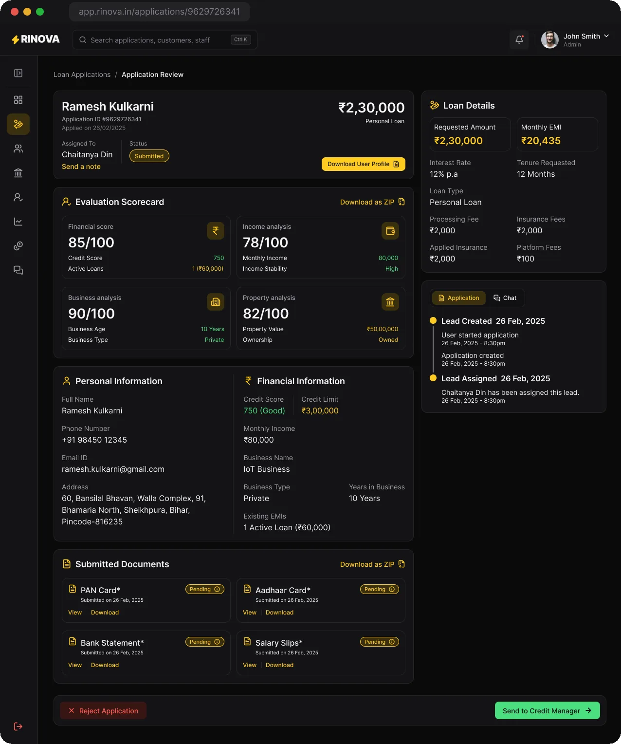
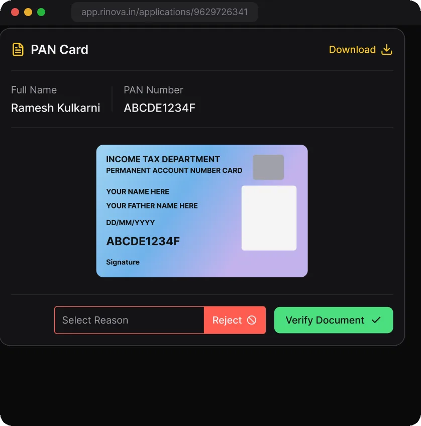
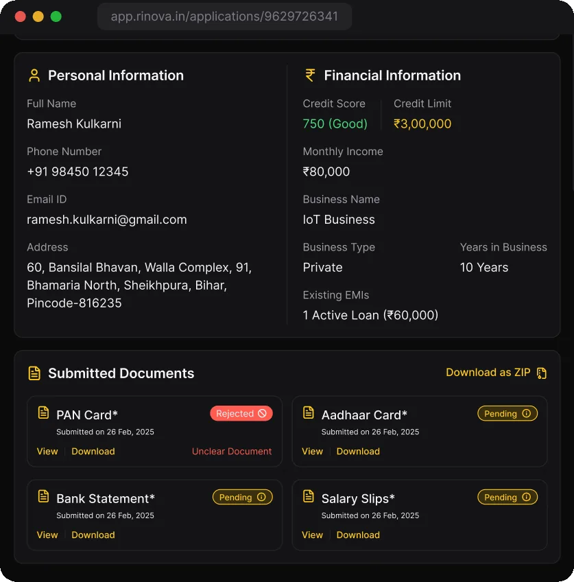
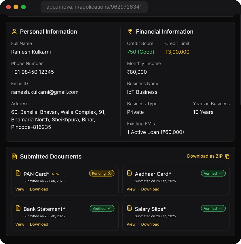
When one document is rejected, the customer re-uploads only that document. Rejection has its own state, message and second check.
01 Check against the details. Each document opens beside the details it should match. Staff verify it, or pick a reason and reject it.
02 The rejection is on record. The document turns red with its reason, and the customer hears through the app or WhatsApp and SMS.
03 The fix comes back flagged. The new upload waits for a second check. Sending the file on stays locked until all four documents are verified.
IIISanction
How a loan is sanctioned, and what the other roles see.
05Sanction
Choosing where the loan is sanctioned
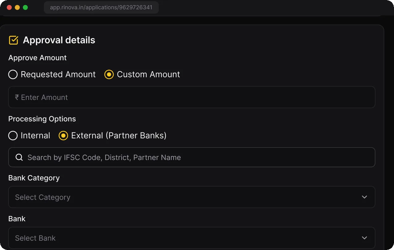
01
Route the file
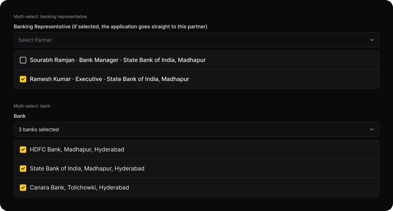
Approve the requested or a custom amount. Choosing external opens search by IFSC, district or partner, a bank category, the banks and an optional named representative.
02
Pick banks or one person
Several banks can be selected at once. Naming a representative sends the file straight to that person's queue at the bank.
03
Confirm before it leaves
A last look at the banks and representatives the file is going to, because a sent file cannot be recalled.
04
Compare the answers
Each bank replies with its amount, rate and EMI. The credit manager sends the chosen offer to the customer. A rejection shows which bank declined.
The bank opens a finished file
Partner banks get their own portal under their own name. Everything a loan officer at SBI needs is already verified, scored and bundled, so they can focus on the decision.
1
Scored and verified
The scorecard and four verified documents come first, with one ZIP for the bank's own records.
2
Documents in one place
Each document can be viewed or downloaded without leaving the file.
3
Approve as requested or adjust
The bank approves the requested amount or sets its own, adds a note and decides.
Only their own files. KPIs, charts and queues count only the files sent to this bank.
Their own products. Representatives, KYC documents, loan products and insurance are managed by the bank itself.
06Every other desk
Each role sees its own work
Admin, staff, affiliates and the sign-in pages.
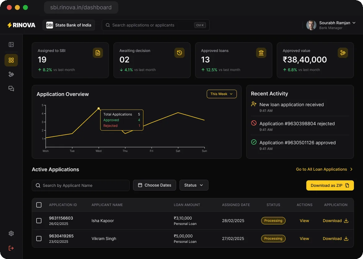
Admin: an overview. How the month is going, which files are moving and each staff member's workload.
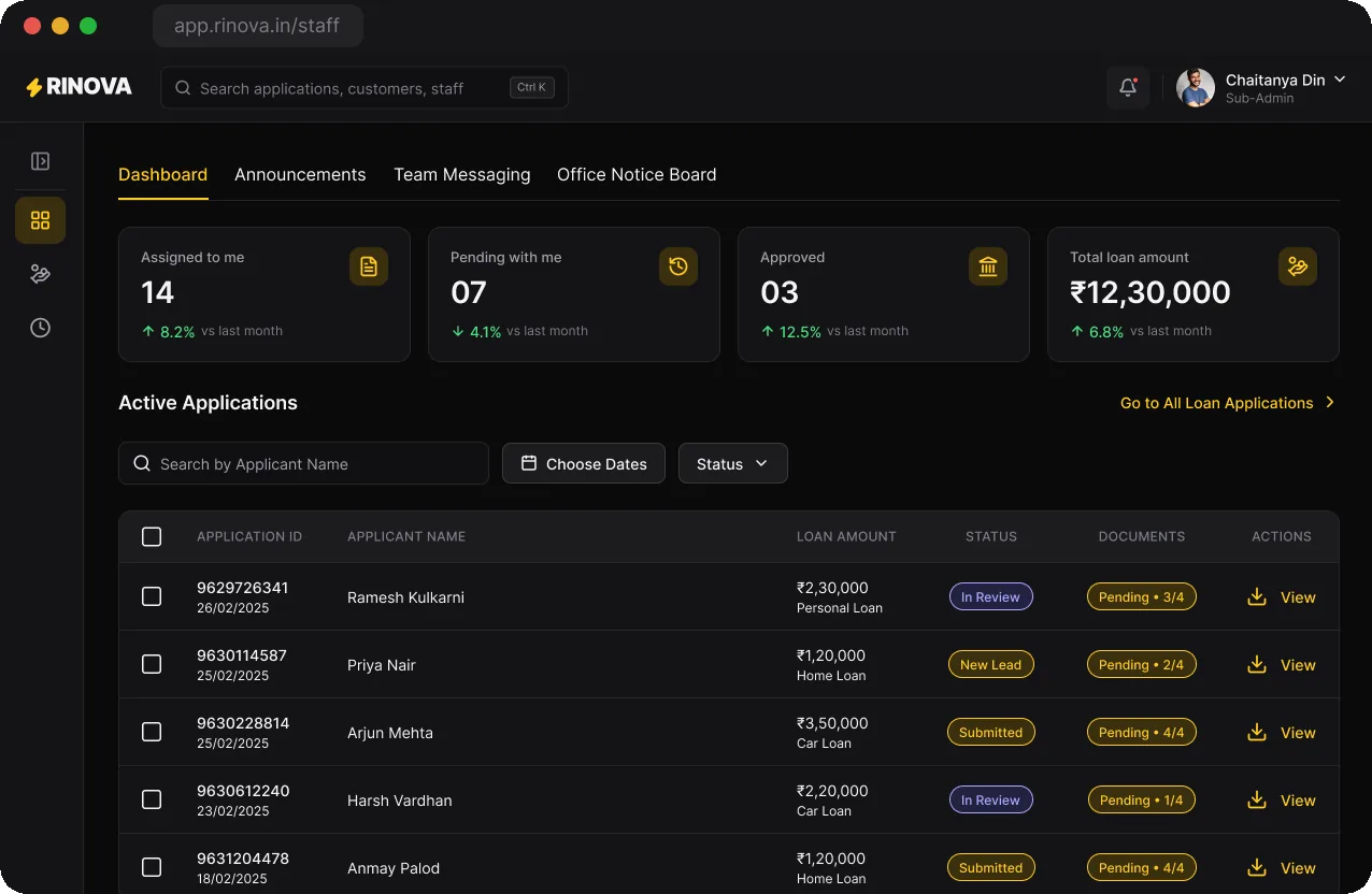
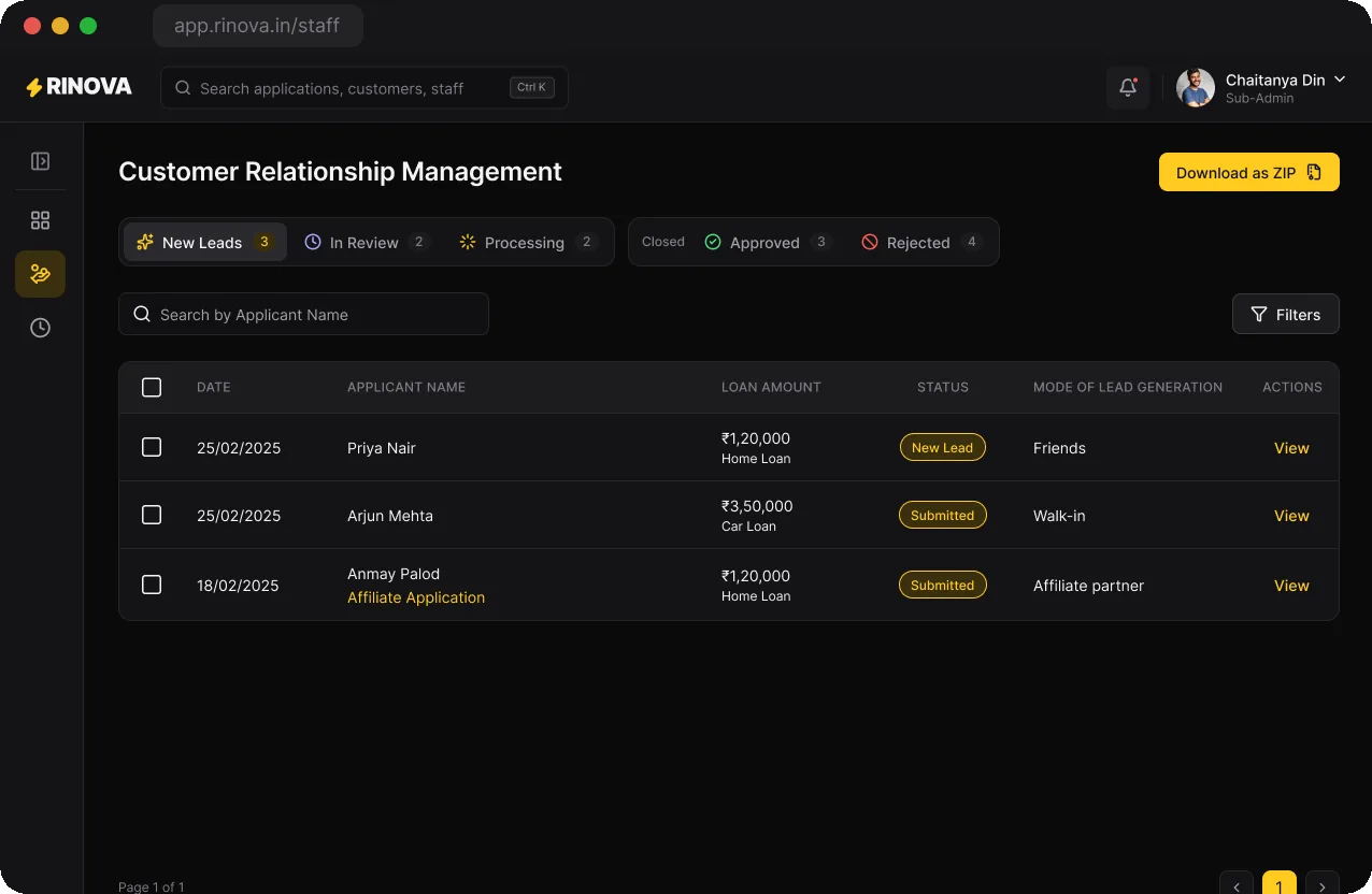
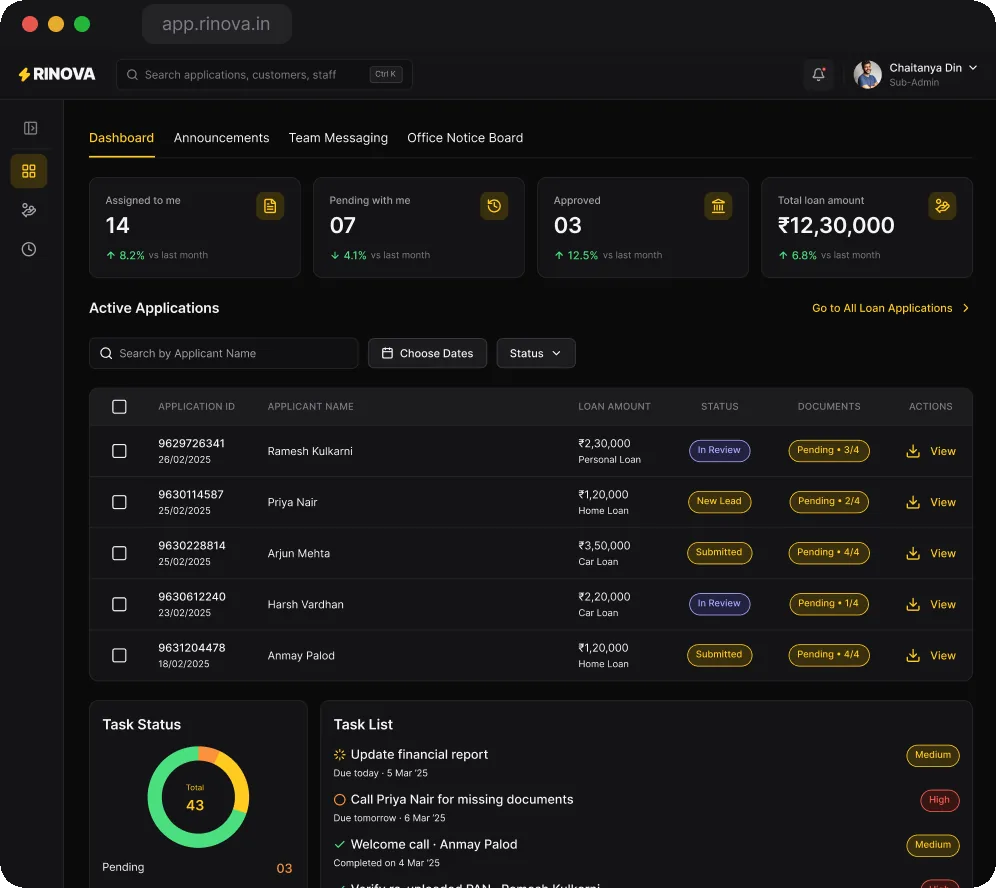
Staff: my files and tasks. Assigned, pending and approved counts are the staff member's own. Tasks from the admin carry a priority and a due date.
A personal CRM. Tabs count only this staff member's leads; closed stages sit together under Closed.
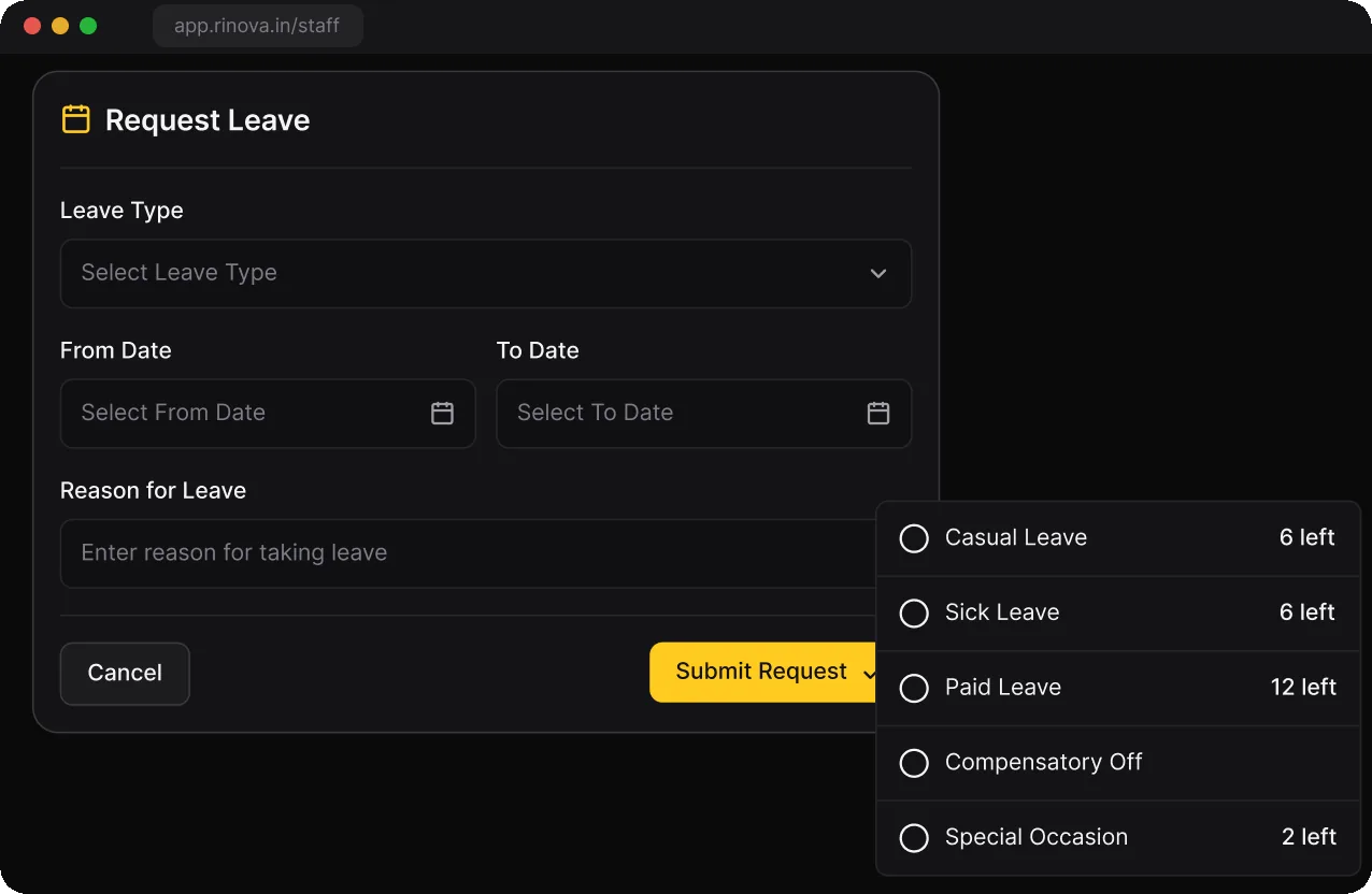
Leave requests. Each leave type shows how many days are left before you pick it.
Affiliates see their leads and their money. Each referral shows its stage and the 2.5% it earns, and nothing from the KYC file.
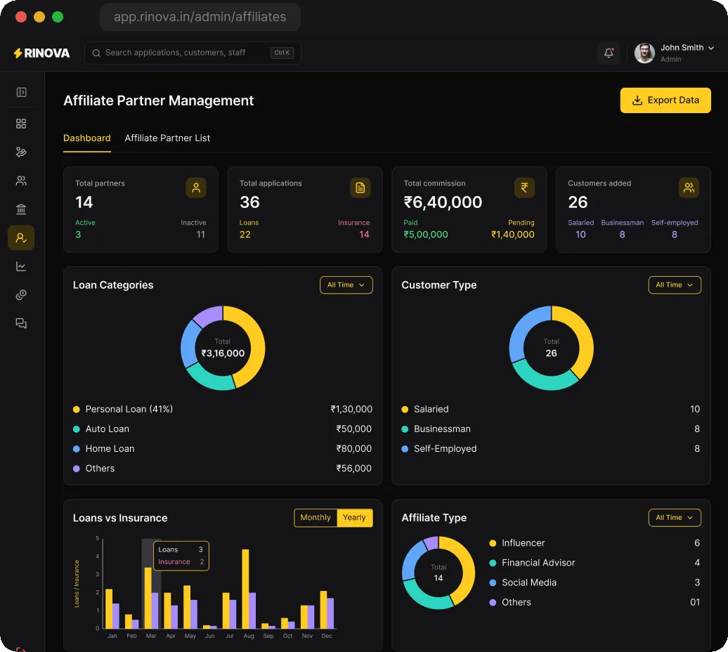
The admin's view of the network. Partners, applications and commission paid and pending, reconciled to the partner list.
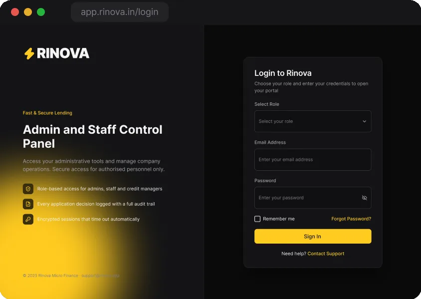
Three sign-in pages. Admin, staff and credit managers share one sign-in with a role picker.
Banks have their own sign-in page.
So do affiliates, with copy written for them.
07The system
Colour shows a file's status
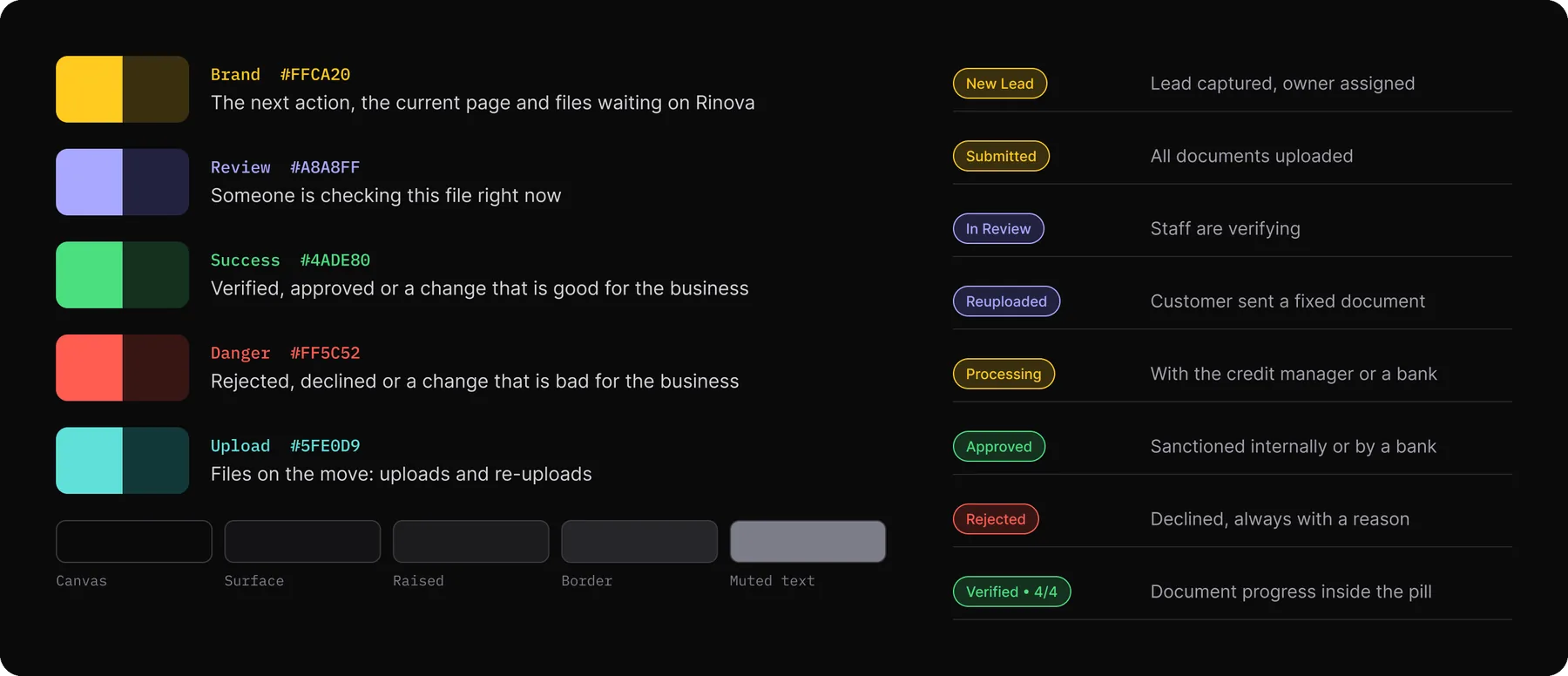
The first build leaned on yellow everywhere. In the system, yellow marks the next action and the page you're on. Every other colour shows where a file is in the process.
It's built on 44 colour variables, 6 text styles and a small set of components with variants, so every one of the 83 screens reads the same way.
IVDisbursal
The developer handoff, changes from the client review and how we'll measure it.
08Building it
What the developers built against
Developers worked alongside the design, so the handoff started with a state model and the screens followed. Every stage has one owner, a fixed list of exits and a message for the customer.
New leadHeld by the staff member the admin assigns
Can go toIn review
The customer sees"Application received" in the app
In reviewHeld by staff
Can go toDocument rejected, or with the credit manager
The customer seesA checklist showing which documents are done
Document rejectedHeld by the customer or affiliate
Can go toRe-uploaded
The customer seesWhatsApp or SMS with the reason; the document turns red in the app
Re-uploadedHeld by staff
Can go toIn review, for a second check
The customer seesNothing until it is checked
With the credit managerHeld by the credit manager
Can go toBack to staff, rejected, sanctioned in-house or sent to banks
The customer sees"Under review"
Sent to banksHeld by each selected bank
Can go toApproved with an offer, or rejected by that bank
The customer sees"Approval pending"
Offer sentHeld by the customer
Can go toAccepted, or a call with the credit manager
The customer seesThe offer with fees, credited amount and EMI
RejectedHeld by nobody
Can go toOne review request from the customer
The customer seesThe reason, and the date they can apply again
Auditing the first build
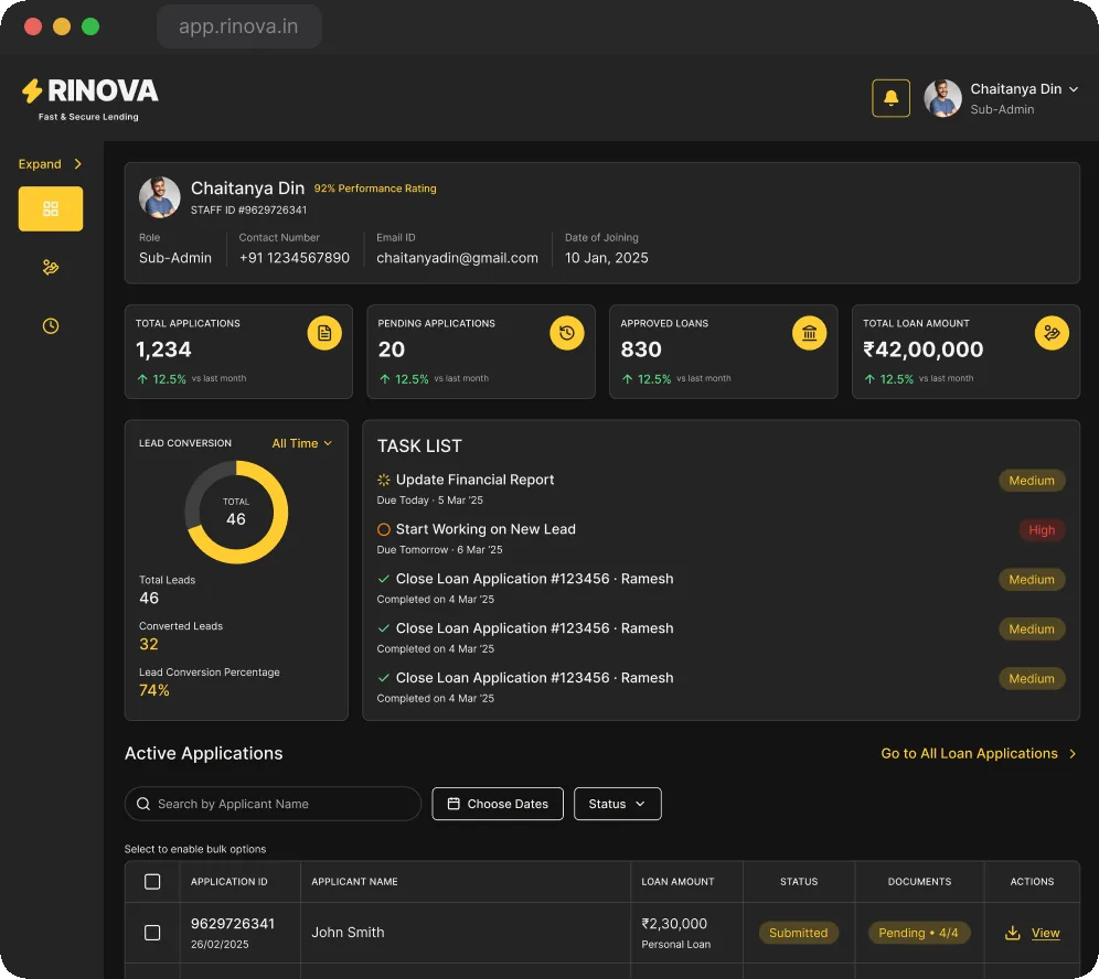
With every screen in place, I audited all 83 against one checklist: hierarchy, colour meaning, tables, forms and the review flow. Drag across the screen to compare.
First buildAfter the audit
Area
Found
Changed
Navigation shell
A 100px header, every sidebar icon yellow, no search
64px header with global search; only the current page is highlighted
Status and colour
Three pill styles; every KPI change green, even rising rejections
One pill style; changes are coloured by what they mean for the business
Tables
Vertical dividers, 16px text, the same applicant in every row
Horizontal rules only, 14px text, realistic and varied rows
Hierarchy
Page titles the same size as card titles; labels in capitals
24px page titles, 18px sections, sentence case throughout
Application review
Loan details under an empty timeline; decision split across columns
Loan terms first; approval and decision in one flow ending in one action row
Modals and forms
Scrims stopped short; a button inside the note box
Full-height scrims, modals in the first view, a separate note field
What changed after the client's review
Scope moved twice: once when the brief became screens, and again with each review round. Tasks with priorities, leave requests, a notice board, a revenue tab and an insurance summary came in. Forecasting and budgets, a lead-conversion card and the staff profile header went out.
BeforeAfter client review
01 The profile header and lead-conversion card left the staff dashboard.
02 Tabs added for announcements, team messaging and the office notice board.
03 A task status donut now sits beside the task list.
09How I used AI
Checking my logic
Where it helped
Generating believable sample data (applicants, amounts, EMIs and fees), so the screens and the audit were checked against varied rows.
Walking the eight stages of the state model and listing exits I might have missed. I checked each suggestion against the client's brief before anything changed.
First drafts of rejection reasons and status messages, which I shortened and rewrote in the lender's language.
What stayed mine
Every call in the decisions list, which came from the brief, the client's notes and the developers' constraints.
What each colour means, and the audit checklist.
What to cut when scope moved.
10How we'll know
Days from lead to sanction
There are no numbers from before launch to compare against, so these are the measures I'd read once real files flow. Each comes from events the timeline already records. The main measure is the median time between "Lead created" and "Offer accepted", since that's what the bet is meant to improve.
Supporting measure
Read from
What it tells us
Files with a re-upload
"Document rejected" events
Which documents customers get wrong at upload, and where the app's guidance needs work
Files sent back to staff
"Back to staff" events from the credit manager
A high share means staff checks and credit rules disagree
Reply time per bank
"Sent to banks" to each "Bank response"
Which partners to rely on for urgent files
Offers accepted
Offers sent against offers accepted
Whether showing every fee upfront lowers acceptance
Referrals that reach approval
Lead source and final stage
Which affiliates bring customers who qualify
What comes next
Launch measures
Record timeline events from day one, so the first month of real files sets the baselines.
A timed walkthrough
Follow one real file from lead to sanction with the staff and credit manager who handle it, and note where they stop or switch tools.
A contrast pass on the dark theme
Check muted text and tinted pills on raised surfaces against WCAG AA before the build freezes the tokens.
See the full case study
All 83 web screens, grouped by portal, are in the full case study on Behance.