Tasks, clients, invoices and time for Indian freelancers, in one app.
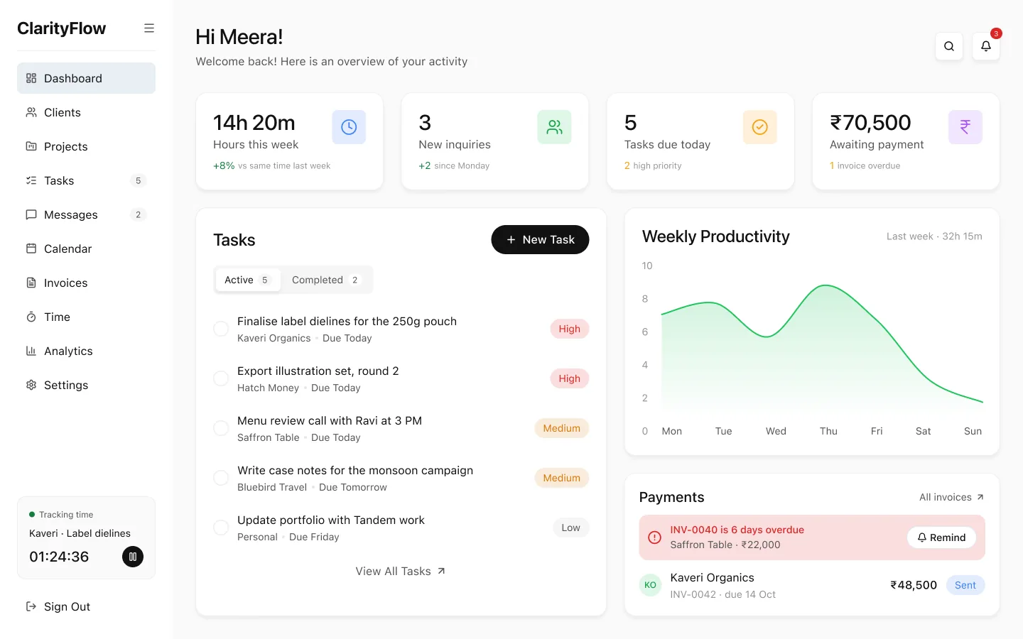
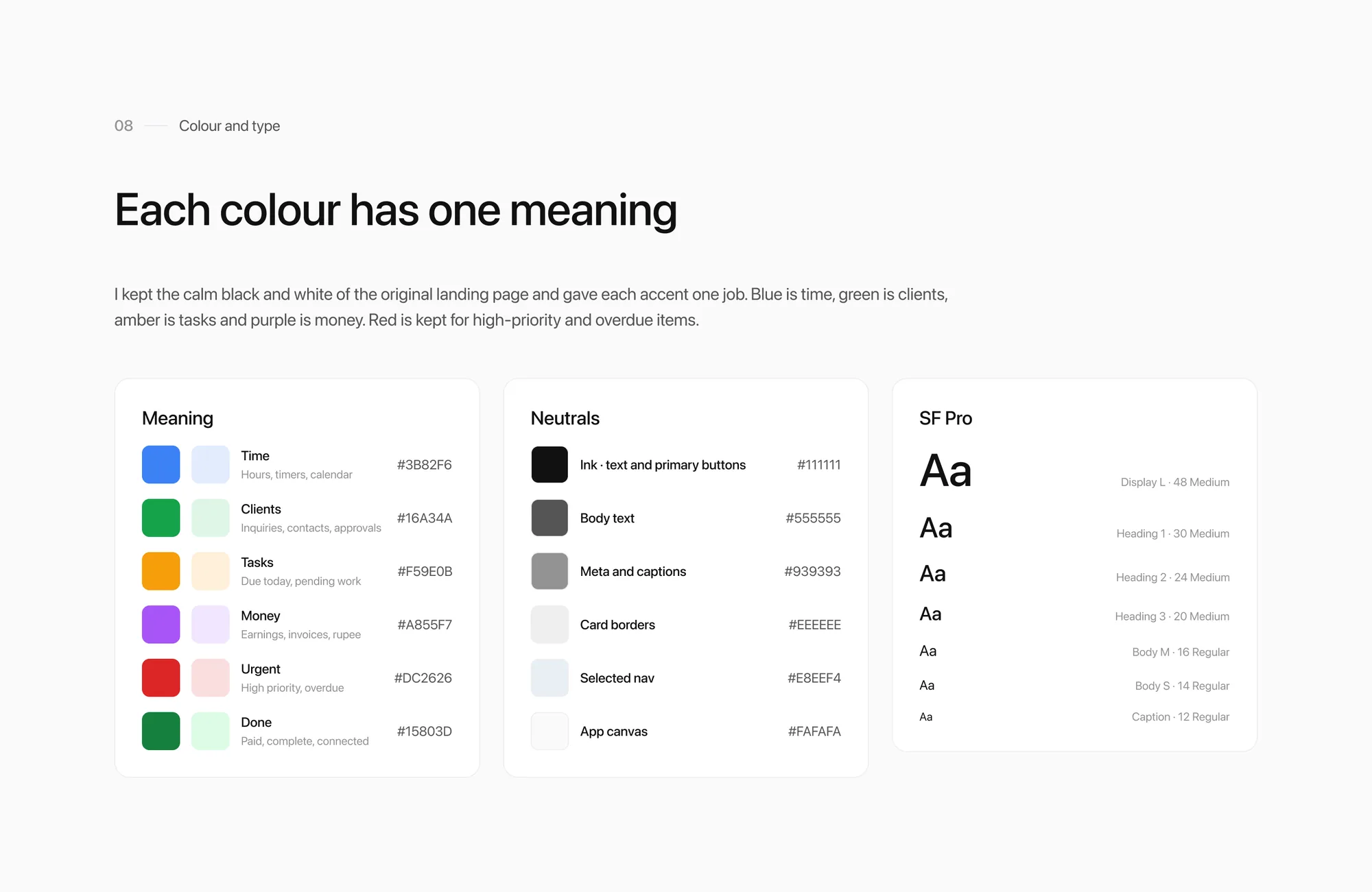
Blue is timeGreen is clientsAmber is tasksPurple is money
app.clarityflow.in/dashboard
A web app for independent designers, developers and writers in India that brings tasks, client conversations, projects, invoices and time into one dashboard.
Role
UX designer: problem framing, UX, UI, design system
Type
Personal concept project
Platform
Responsive web app, desktop first
Delivered
Landing page, 30 app screens, a token-based design system
The problem
A client approves in chat, but the invoice goes out a week later, and unpaid invoices are chased by hand.
What I did
Framed the problem and my assumptions, then designed the product behind a marketing page: 30 screens and one system for both.
The call
Design the money loop first. An approval in the project thread becomes an invoice, with GST or LUT wording picked from the client's country.
01The problem
Freelance work is spread across five apps
A typical freelance week is spread across a notes app for tasks, WhatsApp for approvals, Google Drive for files, a Word template for invoices and memory for hours worked. None of them talk to each other, so things get missed.
It also handles what Indian freelancers deal with every month: GST, export invoices under LUT and clients who pay in pounds or dollars.
Tasks in a notes app→Tasks tied to clients and due dates
Approvals buried in WhatsApp→Approvals in the project thread
Files across Drive and email→Files attached to the project
Invoices in a Word template→Invoices created from an approval
Hours tracked from memory→Timers that turn into billable time
02Who it's for
Designed around one proto-persona
This was a self-initiated concept, so I didn't run interviews. Meera is a proto-persona: my assumptions about a typical Indian freelancer, written down so every decision traces back to someone specific. Testing her with real freelancers is the first thing I'd do next.
MIMeera Iyer · Bengaluru
Freelance brand and packaging designer
6 active clients, 2 overseas. Bills per project and per hour. Uses Notes, WhatsApp, Drive and Word today.
Goals
Know what's due today without opening five apps
Send an invoice the moment work is approved
Get paid on time without awkward follow-ups
Keep evenings free
Frustrations
Approvals get lost in long chat threads
Overseas invoices need GST and LUT wording she has to look up
She forgets to bill hours she worked
Chasing late payments feels personal
03Decisions
Four rules and the decisions that followed
One place for client work
Tasks, messages, files and invoices hang off the same client and project, so context never has to be copied between apps.
Money is always visible
Unpaid, overdue and unbilled amounts appear wherever decisions happen: the dashboard, the client, the project and the timesheet.
Calm by default
A white canvas, one accent per meaning and quiet states. Colour only shows up when something needs attention.
Built for India and abroad
GST, LUT export wording, rupees and foreign currencies are handled for her.
When an invoice starts
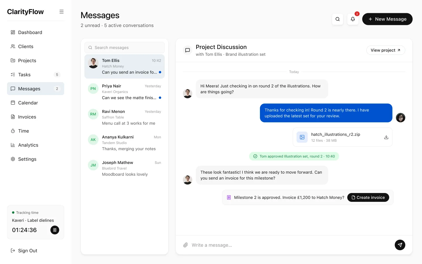
ChoseAn approval in the project thread offers "Create invoice" with the milestone and amount filled in.
ReplacedA Word template, filled in a week later.
WhyPayment is due once work is approved, and Meera wants to invoice right then.
Tax wording
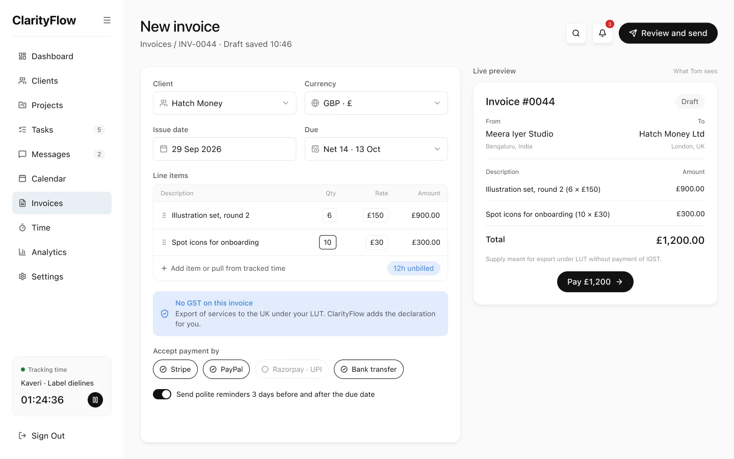
ChoseThe editor picks GST or LUT from the client's country and adds the declaration.
ReplacedWording she has to look up.
WhyIndian clients in her state get CGST and SGST at 9% each, clients in other states get 18% IGST and overseas clients get no GST, under LUT.
Chasing payment
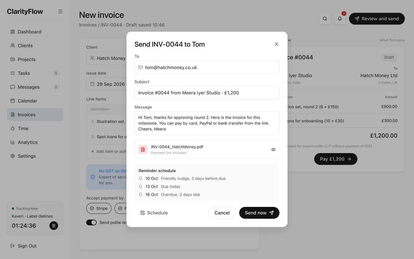
ChoseEvery invoice goes out with its reminder schedule: a friendly nudge before it's due, on the day and after.
ReplacedFollow-ups by hand.
WhyChasing late payments feels personal. Reminders set when the invoice is sent mean she doesn't have to chase it herself.
Tracked time
ChoseThe timesheet calls out unbilled hours and turns them into an invoice in one step.
ReplacedHours from memory.
WhyTracked hours only matter if they get billed. She forgets to bill hours she worked.
Colour
ChoseOne accent per meaning: blue is time, green is clients, amber is tasks, purple is money.
ReplacedColour as decoration.
WhyRed and amber tints stay free for priority and overdue states, so they read as alerts.
04The money loop
From "looks great" to paid in five steps
The flow I cared about most. Approval, invoice and payment used to live in three different places. Here each step hands off to the next, and overdue reminders go out automatically.
01 · Approve
Tom approves round 2 in the project thread
The approval sits where the work was discussed, and the invoice for £1,200 to Hatch Money is one tap away.
02 · Create
The invoice fills itself in
Milestone and amount come from the approval. The tax wording comes from the client's country: an overseas client gets the LUT declaration.
03 · Send
Reminders are set on send
A friendly nudge before it's due, on the day and after, so the app follows up for her.
04 · Pay
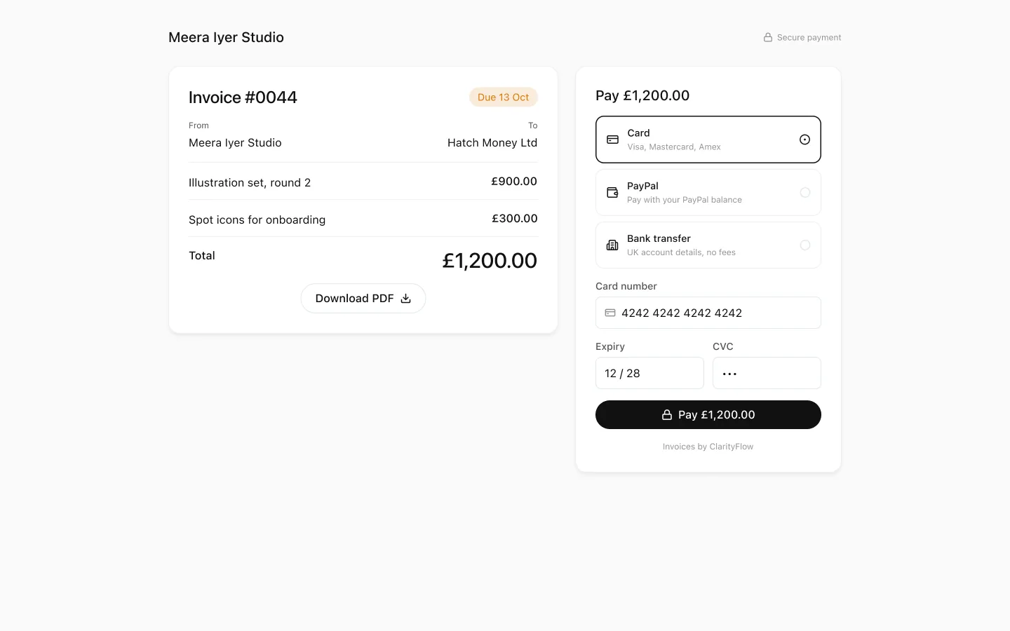
The client pays from a link
Tom opens the invoice from a link and pays it there.
05 · Paid
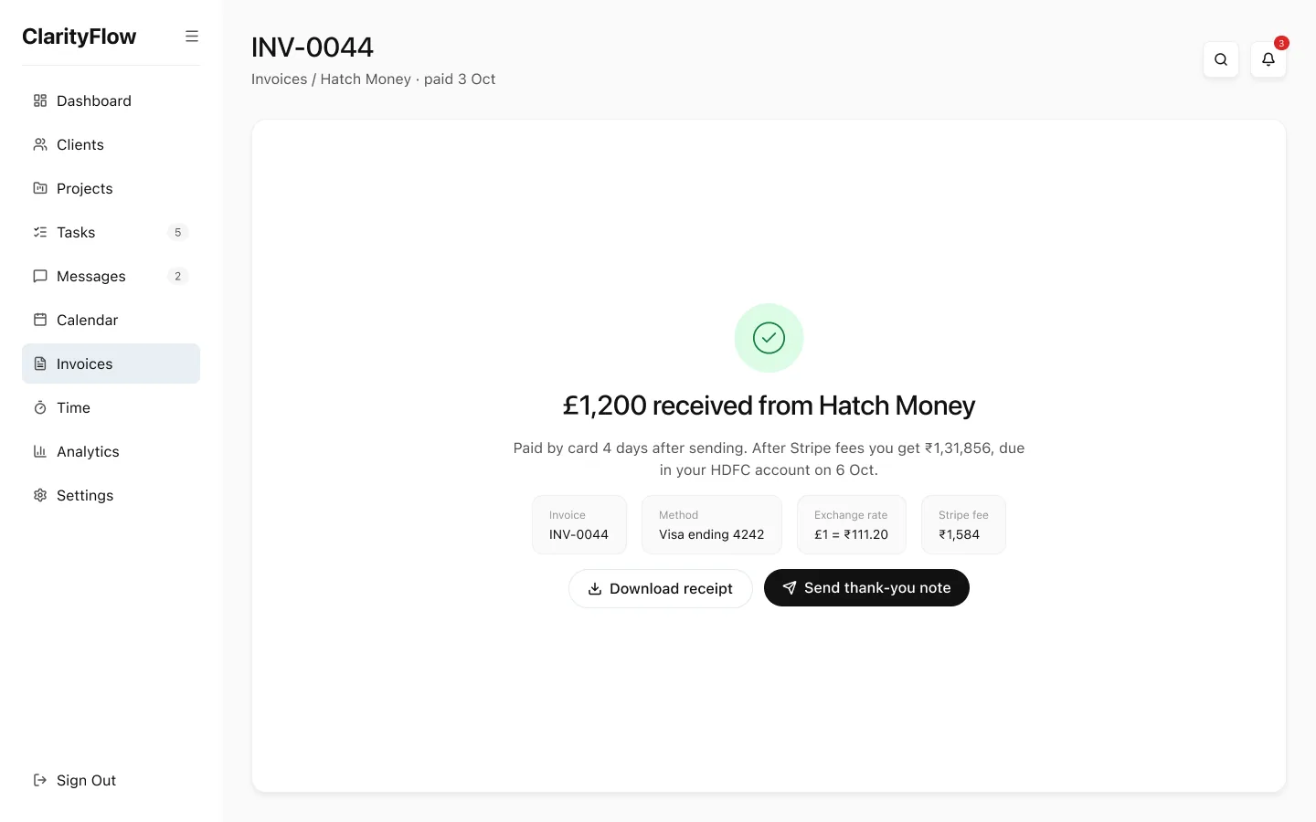
The payment lands
The invoice is marked paid. If it had gone overdue, the reminders would have gone out automatically.
05The product
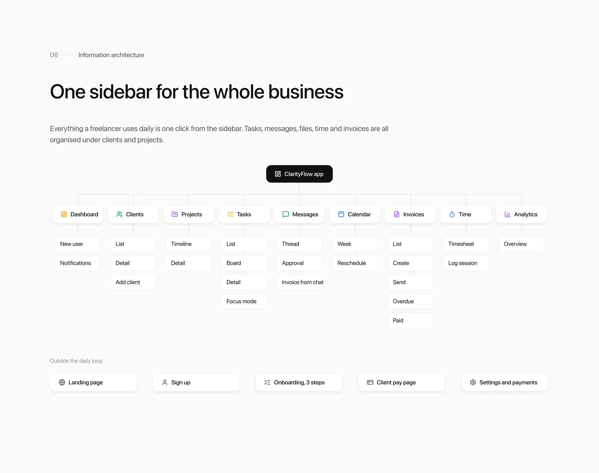
One sidebar for the whole business
Everything is organised around clients and projects. Tasks, messages, files, time and invoices attach to them.
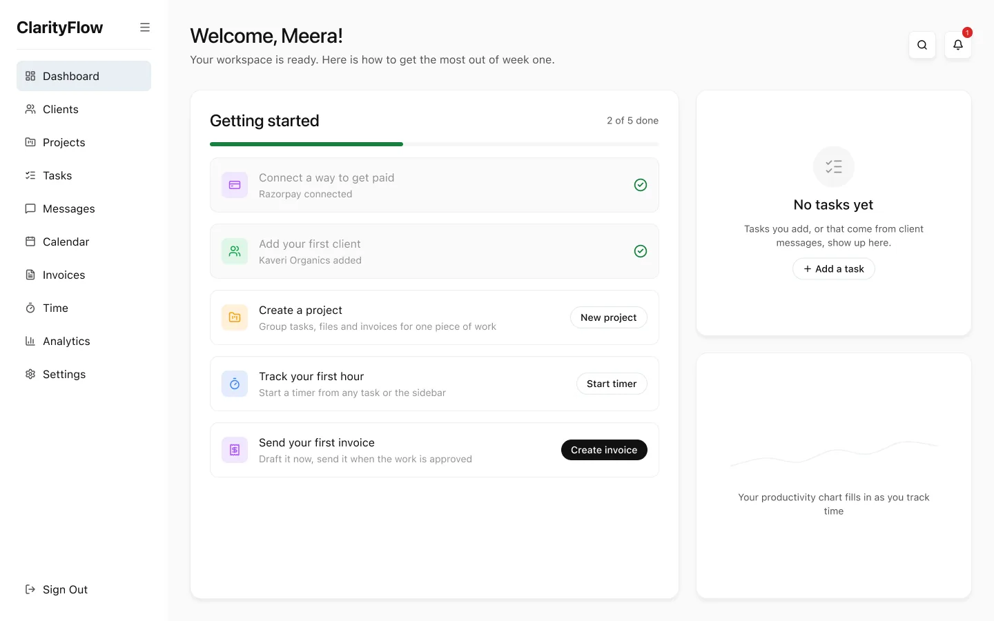
Day one. The dashboard for a new user, before there is any data.
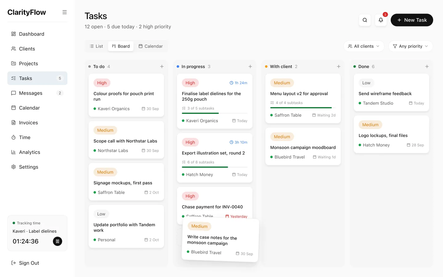
Tasks as a board, tied to clients and due dates.
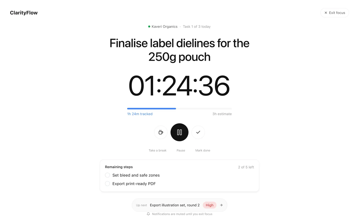
Focus mode for working on one task at a time.
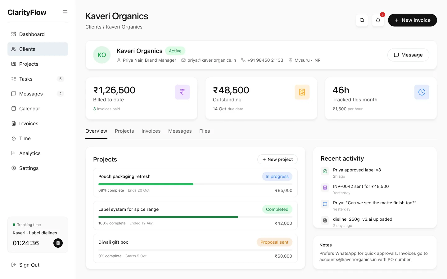
One client in one place. Projects, messages and money in one place.
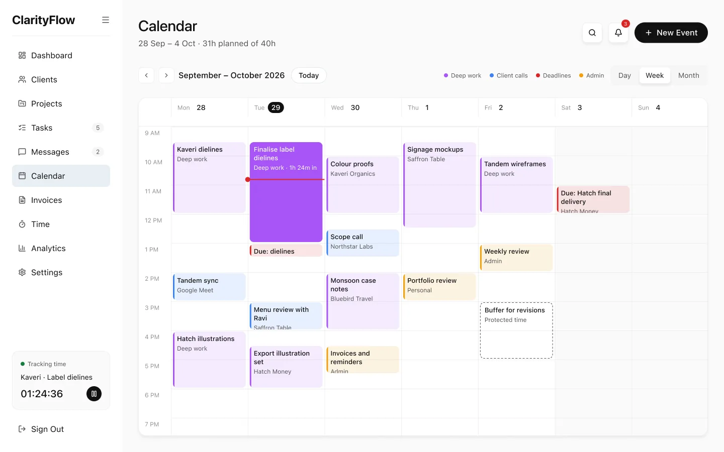
The week view, where you can drag work to reschedule it.
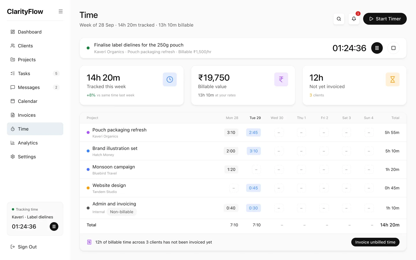
Unbilled hours are highlighted. One step turns them into an invoice.
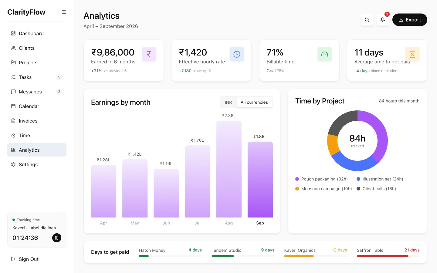
The questions freelancers ask. What am I earning per hour, and who pays late?
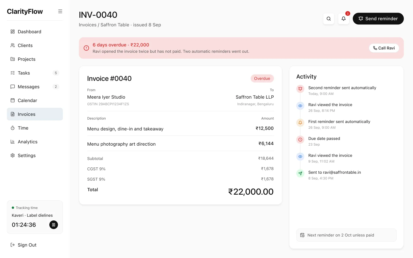
Overdue invoices. The reminder timeline shows what has gone out and what's next.
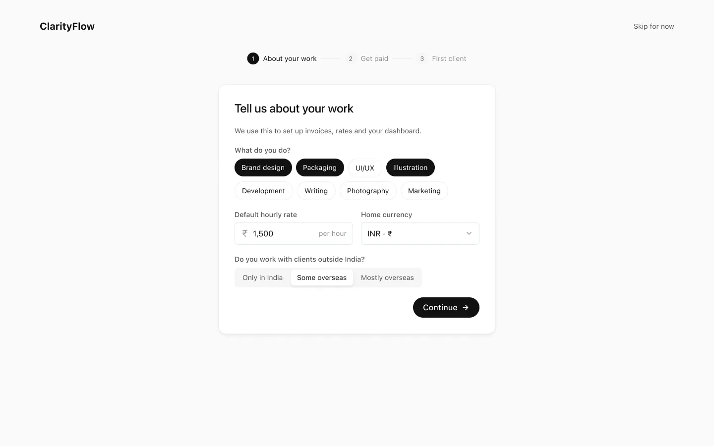
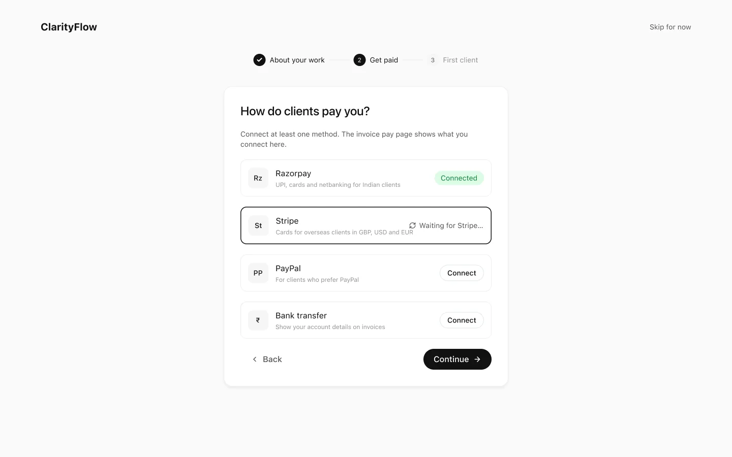
Onboarding in three steps
Sign up, say what kind of work you do, set up how you get paid, then add a first client.
About your work
Get paid
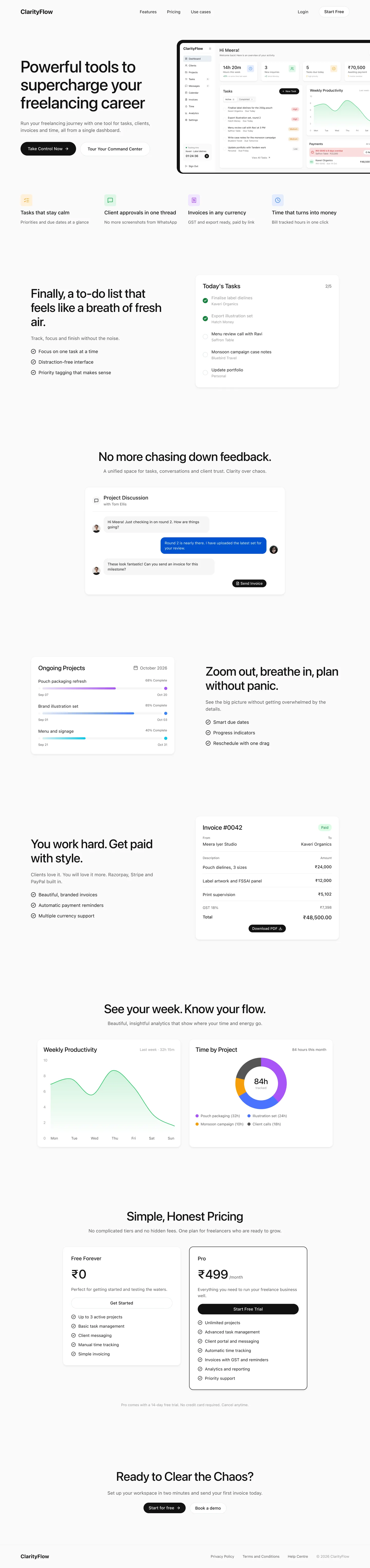
The page it started from
The project started as a single marketing page. To make the promises on that page real, I designed the product behind it, then turned both into one system. Its stats are marketing copy.
clarityflow.in
06The system
Each colour has one meaning
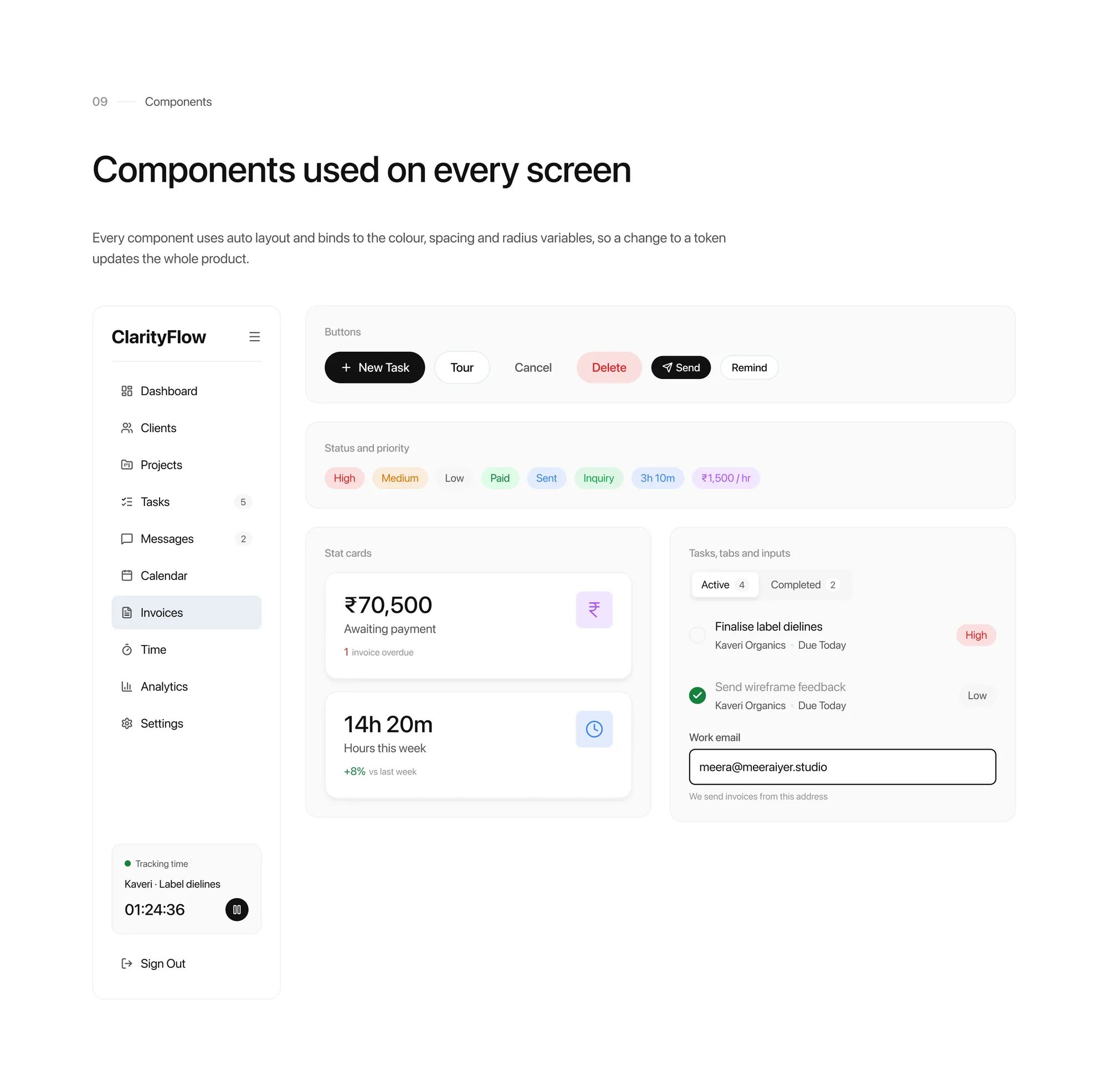
I kept the calm black and white of the original landing page and gave each accent one job. The type scale is SF Pro, from a 48px display down to a 12px caption, and components are built with auto layout.
Meaning colours, neutrals and type.
Components, with every state.
The information architecture.
07How I used AI
A first draft I double-checked
Where it helped
A starting point on GST, LUT and export invoice wording, which I checked against official sources and flagged for a chartered accountant to review.
Cross-checking that the numbers add up across 30 screens: invoice totals, timesheet hours and analytics.
What stayed mine
Meera, and the assumptions I chose to write down.
Putting the money loop at the centre, and the four rules.
Giving each colour one job.
08What I would do next
Where this concept needs real users
Test Meera against real freelancers
Five or six interviews with Indian freelancers who bill overseas clients would confirm or break the proto-persona before anything else is built.
Tune the reminder tone
Automatic reminders help cash flow but can strain a relationship. I'd test wording and timing with people who have chased payments themselves.
Check the tax rules with an expert
GST, LUT and export wording are modelled on how they usually work. A chartered accountant should review every rule before it ships.
Design the phone companion
Timers and approvals happen away from the desk. A small mobile app for those two jobs would be the next thing to design.
Run an accessibility pass
Tinted badges and small captions need contrast checks, and every flow needs a keyboard-only run-through.
Measure the money loop
Days from approval to payment would show whether ClarityFlow is helping.
See the full case study
The complete ClarityFlow case study is on Behance.